Reinventing FF&P
As Frederick Fisher and Partners embarks on a new decade of practice, we wanted to evolve our brand by way of a new visual identity and website experience. And just as we get excited and inspired to start a new project, we were ready to start doing what we often do best: reinvent.
Before the rebrand
Over the course of the last 35 years we’ve had the privilege of collaborating with a number of institutions, individuals, and businesses. With each, we’ve learned that in order to do anything of merit, it can’t be done alone. Nor can it be done in a one-sided manner. There must be true collaboration to achieve something genuine. Something truly impactful. Something “timeless.”
One of the many privileges we’ve had was getting to partner with the team at Commonwealth Projects. Their heart for the work they get to do is extremely sincere, and that is felt in what they design.
“FF&P’s care, commitment and open mind throughout the rebranding process was crucial to the success of the project and a testament to the quality of their practice. The new identity is a true reflection of the firm’s ethos and designed to facilitate their pragmatic and dynamic work.” – Daniel Desure, Founder, Commonwealth Projects
In the end, a new visual identity and online experience was created that not only showcases our work but also communicates the values within the work we do. And because our team achieved a balance between aesthetics and pragmatics, the result was an identity with lasting value.
Rebranded marketing collateral.
We realized that a successful campaign required more than a revamped logo. It demanded a new firm goal, message, a vision that inspires others to see us in a new light.
We sought to set ourselves apart from our competitors. We are sensitive to improving lives through architecture by first and foremost always knowing who our clients are. We don’t create and design after a handshake. We build a relationship and learn more about how we can fit into their world and then hit the ground running.
Our new logo is bold but adaptable to different aesthetics and applications. It is functional as it is an extension of our practice.
In addition to our new primary logo, we wanted to create a versatile and abbreviated version to use for our marketing efforts. It also serves another purpose. While our President and founder is still wholeheartedly engaged in the design process, we know that the future of our firm relies on the strength of its successors. The abbreviated FF&P logo communicates and symbolizes a path towards shaping the future of the firm.
Frederick Fisher and Partners has a simple mission:
Improve lives through architecture.
In creating a new visual aesthetic for our firm, we wanted to be forward-thinking – FF&P is continuously adapting and providing new ways to approach projects and meet our client’s demands. At FF&P, our mission is to improve lives through architecture. It’s a simple statement that speaks to what is inherent in the DNA of our firm culture. Each one of us comes to work every day to make an impact, no matter how big or how small it may be.
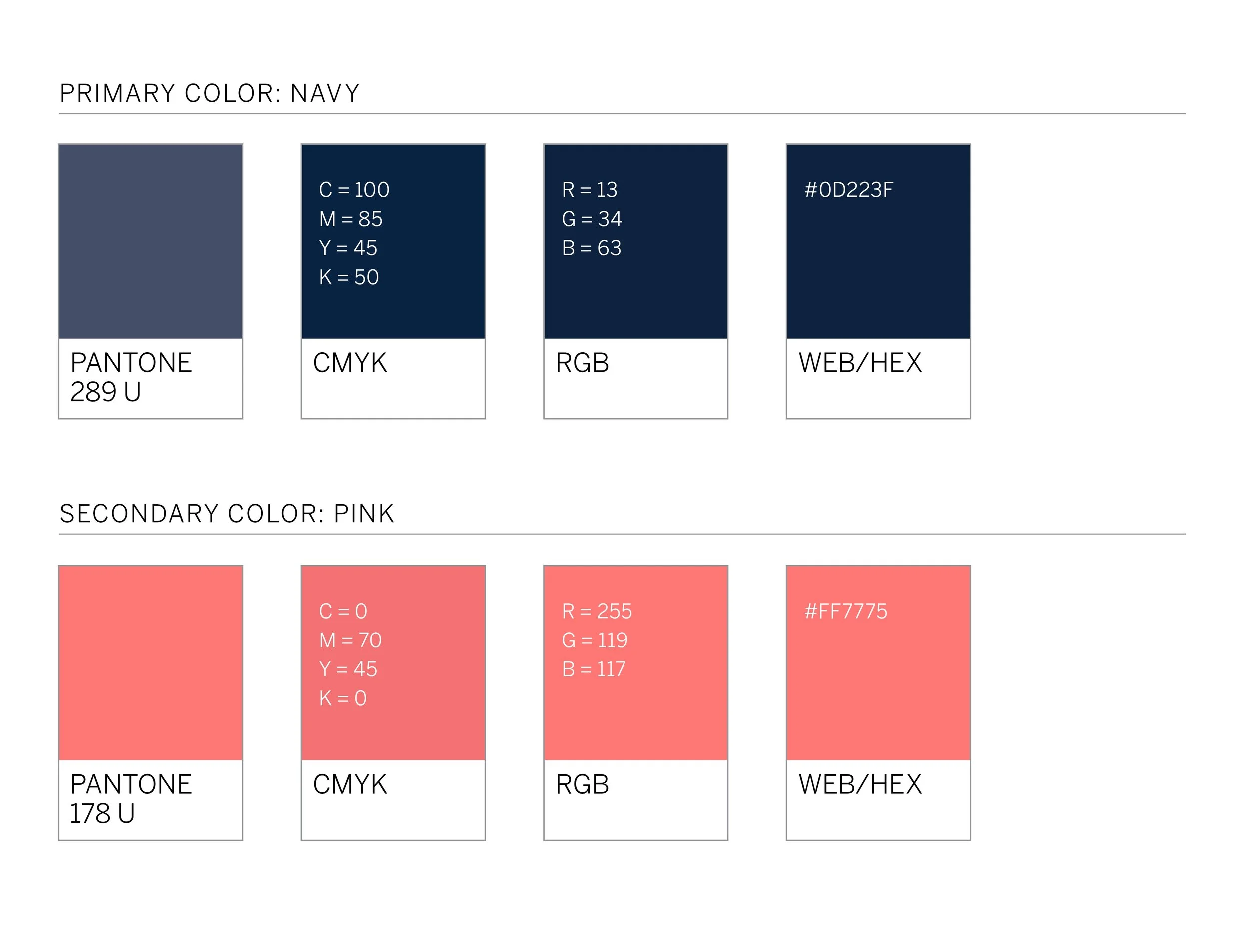
Color played an important consideration in our rebrand identity system. In general, colors have a significant impact on people’s emotional state. They have a wide variety of specific mental associations. In fact, the effects are physiological, psychological and sociological.
Color selection is always the fun part for any brand ideation, and in our case, the colors were quite literally right under our noses - under our founder's nose, to be exact, as it caught Commonweath Project's eye as he began to sketch. That's how our coral accent color landed in our rebrand. It complements our style with just the right amount of punctuation. The dark, bold blue color in our swatch is a calming primary color we were drawn to. And the combination of both, when used in tandem, provides a distinct look that helps to define our brand.
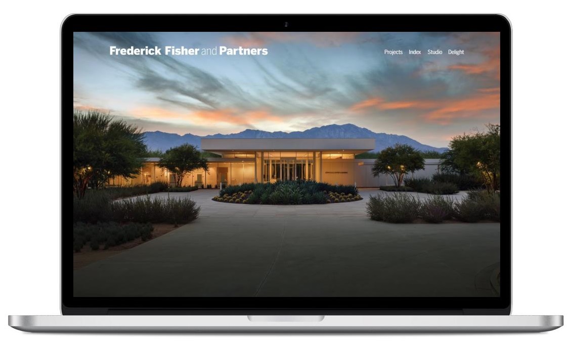
Important to our rebrand was a complete website redesign. The updated site includes changes to navigation, with dropdown menus for both mobile and desktop versions. We’ve also improved the structure of our content. We wanted our content to be informative, to tell a story the way we would tell it. And we wanted to do it all in editorial fashion. When you land on our page, we want you to move throughout and experience the site. We want our audience to be able to navigate to exchanges of information without having to strain their eyes or dig through menus.
There’s a whole host of smaller but impactful changes too, all to make your experience of the website that much better. ‘Delight’ becomes the home for what inspires us. We are influenced by architecture, art, performance, literature and everyday life. It is FF&P’s hope that our audience is influenced by this, too, all in the effort to improve their own lives.
We have also created a host of new graphics, published a gallery’s worth of images, and included a few updates that have made the site easier to use. We invite you to experience them.


